You know what no one buys at thrift stores?
The artwork. Seriously, no one: in every thrift store that I’ve ever been to, the corners are piled with stacks of forlorn-looking faded prints of, like, fruit. Maybe some dancing kids, or a vase of flowers. And because nobody buys them, ever, they’re usually in the realm of a buck or two each.
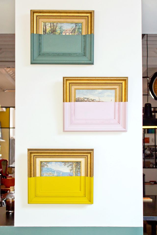
I generally take a peek at the stacks of paintings and posters to see if any of them happen to have really good frames that I can repurpose…but then I saw the below photo on Pinterest and was all: OOOH.
Ooooooo.
Allow me to get all analyze-y for a moment and explain why I like the idea of dipped paintings so much. First, the idea of dipping paintings – effectively destroying existing artwork in an effort to transform it – is an interesting and kind of provocative exploration of the whole “what is art” thing.
But most importantly, a big reason that the majority of thrift-store paintings aren’t especially attractive is that they’re so…blah. And adding bold color – or bold anything – makes a picture that’s dusty and old feel fresh and alive. And making a piece of art that’s sitting in a corner somewhere, unloved and forgotten, into a vibrant image that finds new life on your wall is such a cool thing to do.
It’s saying that artwork that no one wants still has worth; you just have to find a way to make it yours. I love that.
Oh yes, and then there’s the fact that you can’t screw this particular project up. Even if you don’t like the results, all you’ve lost is about a dollar and half an hour or so of your time (during which you were probably watching Below Deck anyway…or at least you were if you are smart, because that show is GENIUS).

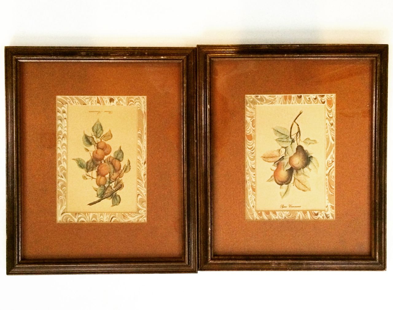
OK, so on my last trip to the thrift store I picked up these paintings. Not because they’re good examples of what I was looking for (which would ideally be paintings with cool frames and a non-terrible mat color)…but rather because I wanted a matched pair, and this was the only one they had. So that was that.
First step: painting those ugly frames, obviously. I went for gold. Obviously.
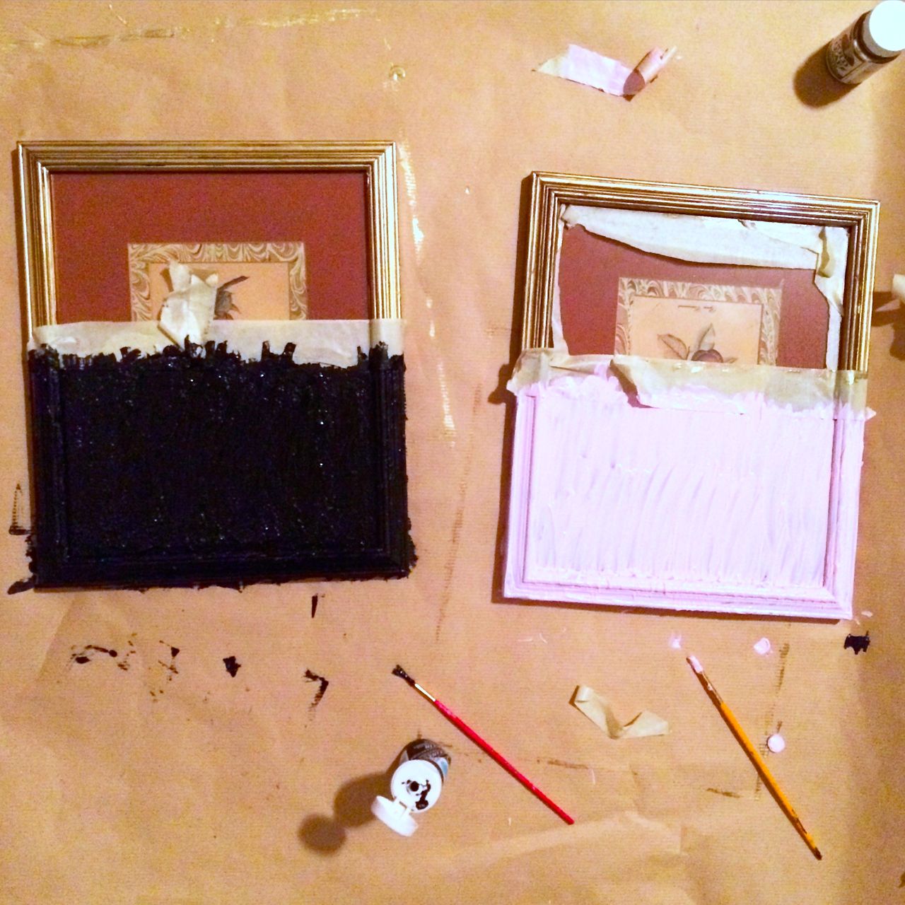
Next (and final) step: I laid a strip of masking tape sideways across the entire painting (frame included) to create a clean line, and then painted the lower halves (with Martha Stewart Crafts Paints, which are great and come in small tubes, so you don’t have to make a big commitment). It took three coats to get a “dipped” (e.g. fully covered) look.
Then I just let the paint dry overnight, pulled off the tape, and…
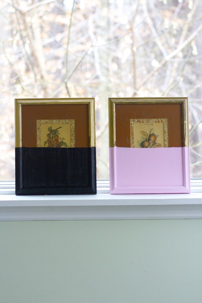
Cool, no???
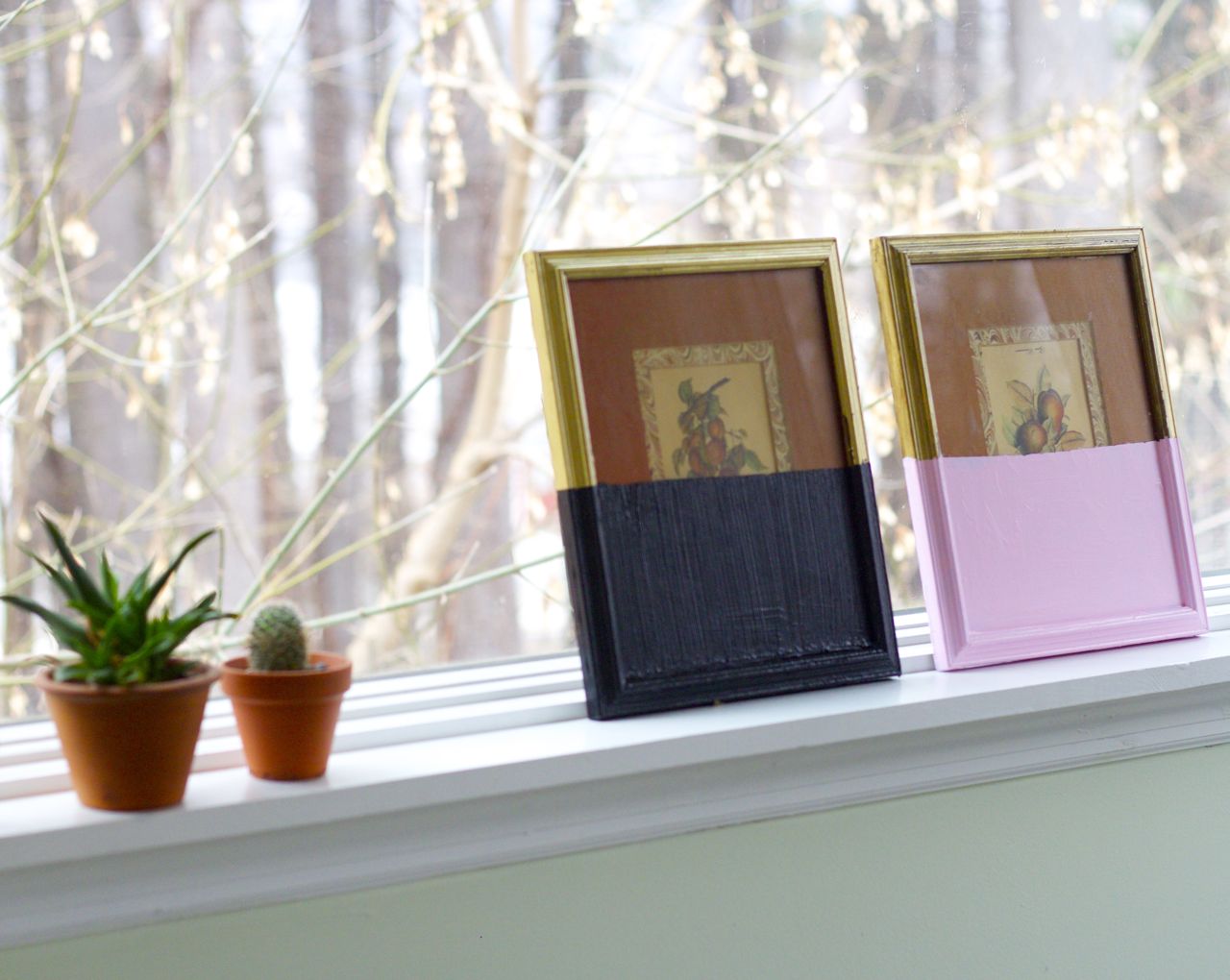
I like it. I think I would have liked neon orange and neon green (to pull out the colors in the fruit) even better. Next time.


Now, project number two, which may be my absolute favorite thing I have made in recent memory, just because it is SO WEIRD, but also kind of…beautiful. I think so, anyway.
We’re going to call it a “Dripped” painting rather than a “Dipped” one. You’ll see why in a moment.
I started with that floral painting above, which can probably best be described by the word “unremarkable.” Why I bought it: it had a nice gold frame, pretty pastel colors…and was $1.50.
I laid a strip of tape about two-thirds of the way up the picture, then painted the top third. Next, I took the squeeze bottle of paint and kind of poured paint across the top of the frame and let it drip down (I set it upright overnight so it would keep dripping while it dried).

The end result: an effect that my friend Erin referred to as “Dexter-ish.” Which I think is quite the compliment.
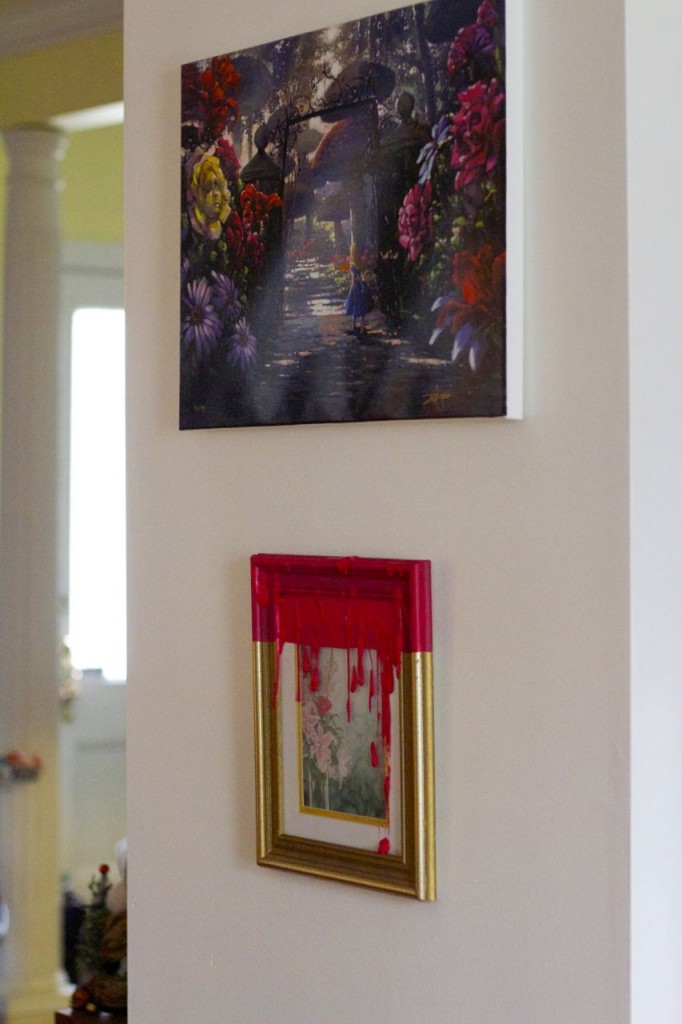
(I hung it under our Alice in Wonderland painting because they have a similarly creepy-whimsical vibe.)
#obsessed #paintallthethings