Now this is what I’d like my table to look like:
Mostly because I love the casual glamour of mismatched china, but also because…well, that’s what I have, and what I suspect you have. I own beautiful Kate Spade plates courtesy of my wedding registry (which themselves are mismatched – each size is from a different silver-and-gold pattern), but everything else is a total mish-mosh of stuff I’ve collected on my travels, from floral serving plates to vintage teacups to Jadeite salt-and-pepper shakers.
So: how do you make lots of things that seem to go together not at all combine to make a picture as pretty as that one?
The key, if you’re going for a mismatched look, is to make sure at least a couple of elements are consistent. My plates, for example, are all different patterns, but each one is either silver, gold, or both, and all my extras are in the Shabby Chic vein, with opaque pastels and gold detailing. In the above shot, the centerpiece colors are all shades of mint and aqua (with a few bright flowers for contrast), and the theme (a sort of Alice In Wonderland feel, with teapots, antiques & books) is clear.
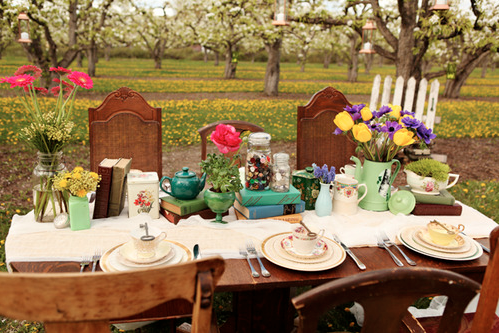
Here’s another example:

So beautiful! Again it’s mismatched, but nearly everything is either blue or cream, and the theme (rustic and romantic) is clear. And both of these tablescapes are pulled together by a strong central element: in the top image, a white table-runner, and in the lower image, a gorgeously distressed piece of wood (you can also use vintage silk – or polyester, so you don’t stress out – scarves and mirrors for an unusual effect).
Images via.